---
title: How to Fix Squarespace Mobile Issues: 18 Simple CSS Fixes That Work
url: https://sukeshdas.com/fix-squarespace-mobile-issues/
description: Fix Squarespace mobile issues with 18 copy-paste CSS snippets: mobile menu, header and logo, font sizes, spacing, sideways scrolling, store grids, buttons and embeds. For Squarespace 7.1.
---
[Home](https://sukeshdas.com/)[Blog](https://sukeshdas.com/blog/)[Squarespace](https://sukeshdas.com/category/squarespace/)
# How to Fix Squarespace Mobile Issues: 18 Simple Copy-Paste CSS Fixes
By Sukesh Das October 3, 2026 14 min read
On this page
1. Squarespace mobile fixes at a glance
2. Before you start
3. Fix 1: How do I add CSS for mobile only in Squarespace?
4. Fix 2: How do I hide a section or block on mobile in Squarespace?
5. Fix 3: How do I style the Squarespace mobile menu?
6. Fix 4: Why does the mobile menu stay open after tapping an anchor link?
7. Fix 5: How do I make the Squarespace header and logo smaller on mobile?
8. Fix 6: How do I show a different logo on mobile?
9. Fix 7: How do I change font sizes on mobile in Squarespace?
10. Fix 8: Why does my Squarespace site scroll sideways on mobile?
11. Fix 9: How do I reduce the space between sections on mobile?
12. Fix 10: How do I stop background images cropping badly on mobile?
13. Fix 11: Why doesn’t my parallax or fixed background work on iPhone?
14. Fix 12: How do I show two products per row on mobile in Squarespace?
15. Fix 13: How do I change gallery columns on mobile?
16. Fix 14: How do I make buttons full width on mobile?
17. Fix 15: How do I center text on mobile only?
18. Fix 16: How do I make embeds and iframes fit on mobile?
19. Fix 17: How do I fix a cramped announcement bar and footer on mobile?
20. Fix 18: How do I add a sticky “Call now” button on mobile?
21. Why does my CSS work in the editor but not on my phone?
22. Squarespace mobile issues FAQs
23. Want your mobile site fixed for you?
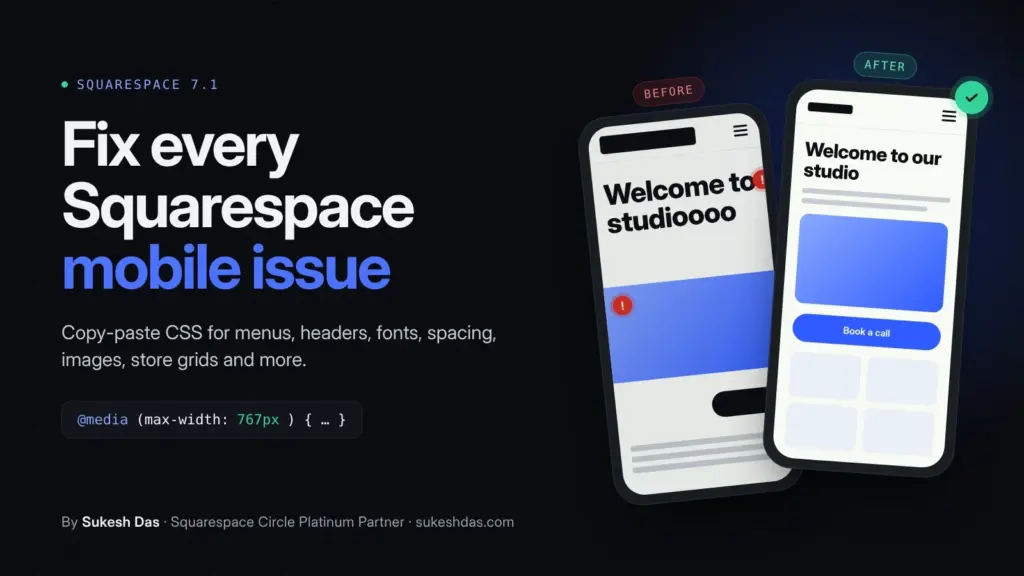
Most Squarespace mobile problems are fixed with a few lines of CSS wrapped in a mobile media query, `@media screen and (max-width: 767px) { ... }`, pasted into `Website → Pages → Custom Code → Custom CSS`. That works on every Squarespace plan. Below are 18 fixes for the issues people ask about most: the mobile menu, header and logo, font sizes, spacing, sideways scrolling, images, store grids, buttons, embeds and more.
I’m Sukesh Das, a Squarespace Circle Platinum Partner. I have built and fixed more than 1,200 websites since 2018. While planning this guide I went through over 7,000 solved questions on the Squarespace Forum, and mobile layout problems came up more than any other topic. Every fix below is written for Squarespace 7.1 and uses plain CSS you can edit.
## Squarespace mobile fixes at a glance
| Problem on mobile | Fix | Where it goes |
| --- | --- | --- |
| Need a rule for phones only | Fix 1: mobile media query | Custom CSS |
| Show or hide a section or block on mobile | Fix 2 | Custom CSS |
| Mobile menu colors, size and alignment | Fix 3 | Custom CSS |
| Menu stays open after tapping an anchor link | Fix 4 | Code Injection |
| Header too tall, logo too big | Fix 5 | Custom CSS |
| Different logo on mobile | Fix 6 | Custom CSS |
| Headings too big on phones | Fix 7 | Custom CSS |
| Page scrolls sideways | Fix 8 | Custom CSS |
| Too much space between sections | Fix 9 | Custom CSS |
| Background image cropped badly | Fix 10 | Custom CSS |
| Parallax or fixed background broken on iPhone | Fix 11 | Custom CSS |
| Store shows one product per row | Fix 12 | Custom CSS |
| Gallery columns on mobile | Fix 13 | Custom CSS |
| Buttons too small or off-center | Fix 14 | Custom CSS |
| Text should be centered on mobile | Fix 15 | Custom CSS |
| Embed or iframe overflows the screen | Fix 16 | Custom CSS + Code Block |
| Announcement bar and footer look cramped | Fix 17 | Custom CSS |
| Sticky “Call now” button on phones | Fix 18 | Code Injection |
## Before you start
- **Custom CSS works on every plan.** Find it at `Website → Pages → Custom Code → Custom CSS`, or search “Custom CSS” in the Squarespace panel.
- **Code Injection** (needed for Fix 4 and Fix 18) requires a Core, Plus or Advanced plan, or the older Business and Commerce plans.
- **Try the mobile editor first.** In Fluid Engine, switch the editor to the phone view and you can move, resize and reorder blocks for mobile without any code. Many “my blocks are in the wrong order on mobile” problems are solved there.
- **Paste one fix at a time** and check the result. A single missing `}` stops every rule below it from working.
## Fix 1: How do I add CSS for mobile only in Squarespace?
Wrap your rules in a media query. Squarespace 7.1 switches to its mobile layout at 767px wide, so this is the breakpoint to use for phones:
```
/* Squarespace mobile fix by Sukesh Das, sukeshdas.com */
/* Phones only */
@media screen and (max-width: 767px) {
/* your mobile rules go here */
}
/* Tablets and desktop only */
@media screen and (min-width: 768px) {
/* your desktop rules go here */
}
```
Every fix below uses this pattern. If one rule does not take effect, add `!important` after the value, because Squarespace often sets styles with higher priority than your custom CSS.
## Fix 2: How do I hide a section or block on mobile in Squarespace?
First find the ID. In Chrome, right-click the section or block on your live site and choose **Inspect** . A section has `data-section-id="..."`. A Fluid Engine block has a class like `fe-block-yui_3_17_2_1_...`. The free Squarespace ID Finder browser extension shows the same IDs with one click.
```
/* Squarespace mobile fix by Sukesh Das, sukeshdas.com */
/* Hide a whole section on phones */
@media screen and (max-width: 767px) {
section[data-section-id="PASTE-SECTION-ID"] {
display: none !important;
}
}
/* Hide a single Fluid Engine block on phones */
@media screen and (max-width: 767px) {
.fe-block-PASTE-BLOCK-ID {
display: none !important;
}
}
/* Hide something on desktop instead: swap the media query */
@media screen and (min-width: 768px) {
section[data-section-id="PASTE-SECTION-ID"] {
display: none !important;
}
}
```
Target the `.fe-block-...` wrapper rather than the inner block. Hiding only the inner block leaves an empty gap in the grid.
## Fix 3: How do I style the Squarespace mobile menu?
The burger icon, the full-screen menu background and the menu links each have their own selector. Change the colors and sizes to match your brand:
```
/* Squarespace mobile fix by Sukesh Das, sukeshdas.com */
/* Burger icon lines */
.header-burger .burger-inner > div {
background-color: #111111 !important;
}
/* Mobile menu background */
.header-menu .header-menu-bg {
background-color: #0a0b0f !important;
}
/* Mobile menu links */
.header-menu-nav-item a {
font-size: 22px !important;
color: #ffffff !important;
letter-spacing: 0.02em;
}
/* Center the mobile menu links */
.header-menu-nav-wrapper {
text-align: center;
}
/* Make the header button full width inside the mobile menu */
.header-menu-cta a {
display: block !important;
width: 100%;
text-align: center;
}
```
These selectors only exist inside the mobile menu, so no media query is needed. The header switches to the burger menu at a width set by your header layout, which is not always 767px, and these rules follow it automatically.
## Fix 4: Why does the mobile menu stay open after tapping an anchor link?
When a menu link points to a section on the same page, such as `/#services`, the page scrolls but the menu stays open on top of it. This script closes the menu when an anchor link is tapped. Paste it into `Code Injection → Footer`:
```
```
## Fix 5: How do I make the Squarespace header and logo smaller on mobile?
```
/* Squarespace mobile fix by Sukesh Das, sukeshdas.com */
@media screen and (max-width: 767px) {
/* Smaller logo on phones */
.header-display-mobile .header-title-logo img {
max-height: 44px !important;
width: auto;
}
/* Less padding above and below the header */
.header .header-announcement-bar-wrapper {
padding-top: 10px !important;
padding-bottom: 10px !important;
}
}
```
Check the header settings first. Squarespace gives the logo a separate mobile height under `Edit Header → Logo`, and that may be all you need.
## Fix 6: How do I show a different logo on mobile?
Upload the mobile logo anywhere on your site (an image block on a hidden page works), copy its image URL, and paste it below. This is useful when your full logo is too wide for phones and you want an icon or short version instead.
```
/* Squarespace mobile fix by Sukesh Das, sukeshdas.com */
@media screen and (max-width: 767px) {
.header-display-mobile .header-title-logo img {
content: url("https://images.squarespace-cdn.com/YOUR-MOBILE-LOGO.png");
max-height: 40px !important;
width: auto;
}
}
```
## Fix 7: How do I change font sizes on mobile in Squarespace?
Large desktop headings often break into awkward lines on phones. Use the Site Styles font settings first, then use this CSS for finer control. `clamp()` scales the size with the screen width:
```
/* Squarespace mobile fix by Sukesh Das, sukeshdas.com */
@media screen and (max-width: 767px) {
h1 { font-size: clamp(2rem, 9vw, 2.6rem) !important; line-height: 1.15 !important; }
h2 { font-size: clamp(1.6rem, 7vw, 2.1rem) !important; line-height: 1.2 !important; }
h3 { font-size: 1.35rem !important; }
.sqs-html-content p { font-size: 1rem !important; line-height: 1.6; }
/* Text set to Large or Small in the text editor */
.sqs-html-content .sqsrte-large { font-size: 1.15rem !important; }
.sqs-html-content .sqsrte-small { font-size: 0.9rem !important; }
}
```
## Fix 8: Why does my Squarespace site scroll sideways on mobile?
Something on the page is wider than the screen: a long word or URL, a wide embed, an image pushed off the edge, or an animation that starts off screen. This stops the sideways scroll without breaking a sticky header:
```
/* Squarespace mobile fix by Sukesh Das, sukeshdas.com */
@media screen and (max-width: 767px) {
html, body {
overflow-x: clip;
}
/* Let long words and URLs wrap */
.sqs-html-content {
overflow-wrap: anywhere;
}
}
```
To find the element causing it, open your site in Chrome, switch to mobile view in DevTools, and run this in the Console. It lists every element that sticks out past the right edge:
```
// Find what overflows, by Sukesh Das, sukeshdas.com
document.querySelectorAll('*').forEach(function (el) {
if (el.getBoundingClientRect().right > window.innerWidth + 1) console.log(el);
});
```
I use `overflow-x: clip` rather than the more common `overflow-x: hidden`, because `hidden` on the body can stop a sticky header from sticking.
## Fix 9: How do I reduce the space between sections on mobile?
```
/* Squarespace mobile fix by Sukesh Das, sukeshdas.com */
@media screen and (max-width: 767px) {
/* Tighter top and bottom padding in every section */
.page-section .content-wrapper {
padding-top: 40px !important;
padding-bottom: 40px !important;
}
/* Remove the forced minimum height from sections set to Medium or Large */
.page-section {
min-height: auto !important;
}
/* Tighter gap for one section only */
section[data-section-id="PASTE-SECTION-ID"] .content-wrapper {
padding-top: 20px !important;
padding-bottom: 20px !important;
}
}
```
Large gaps between blocks inside a Fluid Engine section usually come from empty grid rows in the mobile layout. Open the mobile editor and drag the blocks up to close the gap. CSS can’t remove empty grid rows reliably.
## Fix 10: How do I stop background images cropping badly on mobile?
A wide banner image on a tall phone screen gets cropped, and the important part, often a face or product, can end up off screen. Set the focal point in the image settings first. If that’s still not right on phones, move the crop for mobile only:
```
/* Squarespace mobile fix by Sukesh Das, sukeshdas.com */
@media screen and (max-width: 767px) {
section[data-section-id="PASTE-SECTION-ID"] .section-background img {
object-position: 70% center !important; /* 0% = left edge, 100% = right edge */
}
}
```
Need a completely different image on phones? Add two image blocks, one cropped for desktop and one for mobile, and hide each on the other device with Fix 2.
## Fix 11: Why doesn’t my parallax or fixed background work on iPhone?
Safari on iPhone and iPad does not support `background-attachment: fixed`, so fixed and parallax backgrounds either scroll normally or look zoomed in. If you added a fixed background with custom CSS, switch it off on touch screens so the image displays at its normal size:
```
/* Squarespace mobile fix by Sukesh Das, sukeshdas.com */
@media (hover: none) {
section[data-section-id="PASTE-SECTION-ID"] {
background-attachment: scroll !important;
}
}
```
## Fix 12: How do I show two products per row on mobile in Squarespace?
Check your store page’s design settings first, since newer store layouts include a mobile columns option. If yours doesn’t, this CSS covers both the newer and the older 7.1 store layouts:
```
/* Squarespace mobile fix by Sukesh Das, sukeshdas.com */
@media screen and (max-width: 767px) {
/* Newer 7.1 store layout */
.product-list .product-list-layout-container {
grid-template-columns: repeat(2, minmax(0, 1fr)) !important;
column-gap: 12px !important;
}
/* Older 7.1 store layout */
.products.collection-content-wrapper .list-grid {
grid-template-columns: repeat(2, minmax(0, 1fr)) !important;
grid-gap: 12px !important;
}
/* Keep product titles readable in the narrower columns */
.product-list-item-title,
.grid-title {
font-size: 0.95rem !important;
}
}
```
## Fix 13: How do I change gallery columns on mobile?
```
/* Squarespace mobile fix by Sukesh Das, sukeshdas.com */
@media screen and (max-width: 767px) {
/* Gallery grid sections: two images per row on phones */
.gallery-grid-wrapper {
grid-template-columns: repeat(2, 1fr) !important;
gap: 8px !important;
}
}
```
## Fix 14: How do I make buttons full width on mobile?
Full-width buttons are easier to tap and stop buttons from sitting off-center when blocks stack:
```
/* Squarespace mobile fix by Sukesh Das, sukeshdas.com */
@media screen and (max-width: 767px) {
.sqs-block-button .sqs-block-button-element {
display: block !important;
width: 100% !important;
text-align: center !important;
padding-top: 16px !important;
padding-bottom: 16px !important;
}
}
```
## Fix 15: How do I center text on mobile only?
Left-aligned text that looks right next to an image on desktop can look lopsided once blocks stack on a phone:
```
/* Squarespace mobile fix by Sukesh Das, sukeshdas.com */
@media screen and (max-width: 767px) {
.sqs-html-content h1,
.sqs-html-content h2,
.sqs-html-content h3,
.sqs-html-content p {
text-align: center !important;
}
}
```
To center only one section, add `section[data-section-id="PASTE-SECTION-ID"]` in front of each selector.
## Fix 16: How do I make embeds and iframes fit on mobile?
Booking widgets, maps and videos pasted as code often keep a fixed width and spill off the screen. This CSS keeps them inside the page:
```
/* Squarespace mobile fix by Sukesh Das, sukeshdas.com */
.sqs-block-code iframe,
.sqs-block-embed iframe {
max-width: 100% !important;
}
/* Responsive 16:9 wrapper for videos */
.sd-embed {
position: relative;
aspect-ratio: 16 / 9;
width: 100%;
}
.sd-embed iframe {
position: absolute;
inset: 0;
width: 100%;
height: 100%;
border: 0;
}
```
Then wrap the embed in a Code Block like this:
```
```
If you use a self-hosted background video in a Code Block, add `autoplay muted loop playsinline` to the video tag. Without `muted` and `playsinline`, iPhones will not autoplay it. Phones in Low Power Mode may still block autoplay, so always set a fallback image.
## Fix 17: How do I fix a cramped announcement bar and footer on mobile?
```
/* Squarespace mobile fix by Sukesh Das, sukeshdas.com */
@media screen and (max-width: 767px) {
/* Smaller announcement bar text */
.sqs-announcement-bar-dropzone p {
font-size: 13px !important;
line-height: 1.4 !important;
}
/* Center footer text and social icons */
#footer-sections .sqs-html-content {
text-align: center !important;
}
#footer-sections .sqs-svg-icon--list {
justify-content: center !important;
}
}
```
## Fix 18: How do I add a sticky “Call now” button on mobile?
For local businesses, a call or booking button that stays at the bottom of the screen on phones is one of the easiest ways to get more enquiries. Paste this into `Code Injection → Footer` and change the phone number, label and color:
```
Call now
```
To link to a booking page instead, replace `tel:+15555550123` with the page URL, for example `/book`.
## Why does my CSS work in the editor but not on my phone?
- **The editor preview is not a real phone.** The mobile preview in Squarespace is a narrow window, not a phone browser. Always check on a real device.
- **Your phone is showing a cached page.** Open the site in a private tab, or add `?nocache=1` to the end of the URL.
- **A typo is breaking everything below it.** One missing `}` or `;` stops every rule after it. Paste your CSS into a free validator such as the [W3C CSS Validator](https://jigsaw.w3.org/css-validator/) to find it.
- **Squarespace’s own style wins.** Add `!important` to the property, or make the selector more specific with a section ID.
- **The selector is out of date.** Squarespace changed the page structure of 7.1 standalone pages in 2026, and older forum snippets that use `#sections > .page-section` may no longer match. Every selector in this guide avoids that pattern.
## Squarespace mobile issues FAQs
### What is the mobile breakpoint in Squarespace 7.1?
767px. Squarespace 7.1 switches to its mobile layout at screens 767px wide and below, so use `@media screen and (max-width: 767px)` for phone-only CSS. The header can switch to the burger menu at a different width, depending on your header layout.
### Can I edit the mobile layout separately from desktop in Squarespace?
Yes, for sections built with Fluid Engine. Switch the editor to the phone view and you can move, resize and reorder blocks for mobile without changing desktop. Fonts, colors and hiding content per device still need CSS.
### Do I need a paid plan to fix mobile issues with CSS?
No. Custom CSS is available on every Squarespace plan, so Fixes 1 to 3 and 5 to 17 work on any plan. Fixes 4 and 18 use Code Injection, which needs a Core, Plus or Advanced plan, or an older Business or Commerce plan.
### How do I hide something on mobile in Squarespace without code?
In a Fluid Engine section you can shrink or move a block in the mobile editor, but there is no built-in switch to hide a block or section on one device. To hide it completely, use the short CSS in Fix 2.
### Why are my Squarespace blocks in the wrong order on mobile?
Fluid Engine builds a separate mobile layout. When you add or move blocks on desktop, the mobile order can change. Open the mobile editor and drag the blocks into the order you want; it doesn’t affect desktop.
### How do I find a section or block ID in Squarespace?
Right-click the element on your live site in Chrome and choose Inspect. Look for `data-section-id` on a section or a `fe-block-...` class on a Fluid Engine block. The free Squarespace ID Finder extension for Chrome shows these with one click.
### Will mobile CSS slow down my Squarespace site?
No. A few hundred lines of CSS add almost nothing to load time. Unused third-party scripts and large uncompressed images slow a site down far more.
### Does a broken mobile layout hurt my SEO?
It can. Google ranks pages based on their mobile version, and problems such as sideways scrolling, tiny tap targets and text too small to read make for a poor experience on phones. Fixing them is good for visitors and for search.
### Do these fixes work on Squarespace 7.0?
The media query pattern and the general approach work on 7.0, but many selectors are different there because each 7.0 template family has its own structure. This guide is written for Squarespace 7.1.
## Want your mobile site fixed for you?
If you would rather not touch code, I can review your site on real phones, fix the layout issues and test everything before handing it back. I build and support Squarespace sites every week as a [Squarespace web designer](https://sukeshdas.com/services/squarespace-web-designer/). [Send me a short brief](https://sukeshdas.com/contact-us/?service=squarespace#brief) and I will reply within one working day.
Related guide: [How to add age verification to Squarespace with free popup code](https://sukeshdas.com/how-to-add-an-age-verification-popup-to-your-squarespace-website-no-plugins-needed/).
Related service
[Squarespace website development](https://sukeshdas.com/services/squarespace-web-designer/)
Squarespace 7.1 sites that do not look like a template. As a Squarespace Circle Platinum Partner, custom code, member areas and commerce are routine work for me.
[See the service](https://sukeshdas.com/services/squarespace-web-designer/) [Case study: Avi Dear Visuals](https://sukeshdas.com/project/avi-dear-visuals/)
Share this article
- [Squarespace 7.1](https://sukeshdas.com/tag/squarespace-7-1/)
- [Squarespace mobile CSS](https://sukeshdas.com/tag/squarespace-mobile-css/)
- [Squarespace mobile issues](https://sukeshdas.com/tag/squarespace-mobile-issues/)
- [Squarespace mobile menu](https://sukeshdas.com/tag/squarespace-mobile-menu/)
- [Squarespace responsive design](https://sukeshdas.com/tag/squarespace-responsive-design/)

Written by Sukesh Das
Web designer and developer with 1,200+ sites built. If this article describes your problem, I can fix it for you.
[Ask me about your site](https://sukeshdas.com/contact-us/)
## Start the discussion [Cancel reply](/fix-squarespace-mobile-issues/?format=md#respond)
On this page
14 min read
1. Squarespace mobile fixes at a glance
2. Before you start
3. Fix 1: How do I add CSS for mobile only in Squarespace?
4. Fix 2: How do I hide a section or block on mobile in Squarespace?
5. Fix 3: How do I style the Squarespace mobile menu?
6. Fix 4: Why does the mobile menu stay open after tapping an anchor link?
7. Fix 5: How do I make the Squarespace header and logo smaller on mobile?
8. Fix 6: How do I show a different logo on mobile?
9. Fix 7: How do I change font sizes on mobile in Squarespace?
10. Fix 8: Why does my Squarespace site scroll sideways on mobile?
11. Fix 9: How do I reduce the space between sections on mobile?
12. Fix 10: How do I stop background images cropping badly on mobile?
13. Fix 11: Why doesn’t my parallax or fixed background work on iPhone?
14. Fix 12: How do I show two products per row on mobile in Squarespace?
15. Fix 13: How do I change gallery columns on mobile?
16. Fix 14: How do I make buttons full width on mobile?
17. Fix 15: How do I center text on mobile only?
18. Fix 16: How do I make embeds and iframes fit on mobile?
19. Fix 17: How do I fix a cramped announcement bar and footer on mobile?
20. Fix 18: How do I add a sticky “Call now” button on mobile?
21. Why does my CSS work in the editor but not on my phone?
22. Squarespace mobile issues FAQs
23. Want your mobile site fixed for you?
Browse topics Squarespace
- [Squarespace7](https://sukeshdas.com/category/squarespace/)
- [Website & Conversion7](https://sukeshdas.com/category/website-conversion/)
- [Tutorial3](https://sukeshdas.com/category/tutorial/)
- [Divi2](https://sukeshdas.com/category/tips-tricks/divi/)
- [Lead Generation2](https://sukeshdas.com/category/lead-generation/)
- [SEO & Local SEO2](https://sukeshdas.com/category/seo-local-seo/)
- [AI Search1](https://sukeshdas.com/category/ai-search/)
- [Wordpress1](https://sukeshdas.com/category/wordpress/)
- [Elementor1](https://sukeshdas.com/category/tips-tricks/elementor/)
- [All articles](https://sukeshdas.com/blog/)
Want this handled for you?
Send a short brief and get a fixed quote.
[Get a free quote](https://sukeshdas.com/contact-us/)
Keep reading
## More from the *blog.*
[All articles](https://sukeshdas.com/blog/)
SEO & Local SEO Oct 3, 2026
### [Squarespace Schema Markup: 5 Proven JSON-LD Templates (Free)](https://sukeshdas.com/squarespace-schema-markup/)
Learn what Squarespace schema markup the platform adds on its own and how to add the…
13 min read
Lead Generation Oct 3, 2026
### [Floating WhatsApp Button: Free Chat Widget Code for Any Website (6 Platforms)](https://sukeshdas.com/free-floating-whatsapp-button/)
Add a free floating WhatsApp button to any website with one copy-paste code: settings for number,…
15 min read
AI Search Oct 3, 2026
### [Squarespace AI SEO: 10 Proven Ways to Get Cited by ChatGPT, Perplexity and Google AI Overviews](https://sukeshdas.com/squarespace-ai-seo/)
Squarespace AI SEO explained by a Squarespace Circle Platinum Partner: how ChatGPT, Perplexity and Google AI…
13 min read