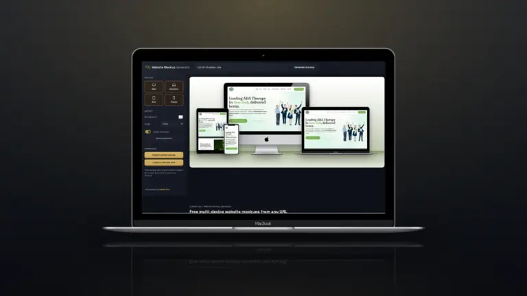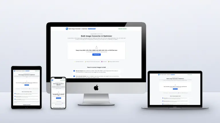

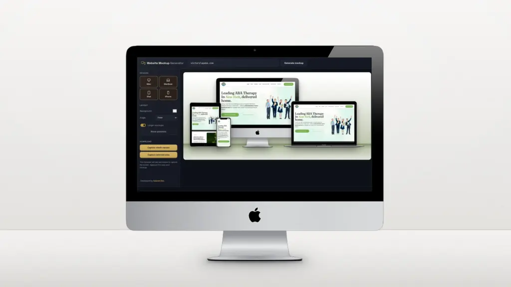
A good mockup shows a website the way a client imagines it: on a real screen, on a desk, on a phone in someone’s hand. Making one used to mean Photoshop templates, smart objects and a screenshot for every device. If the site is already live, or on a public staging link, you can now do it straight from the URL.
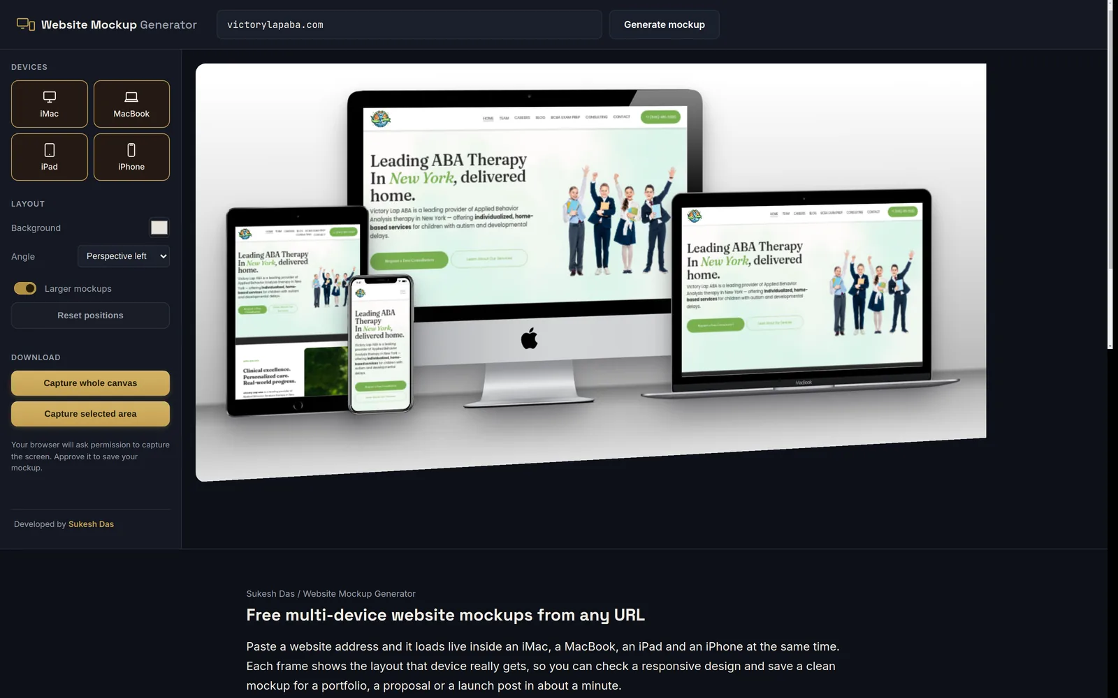
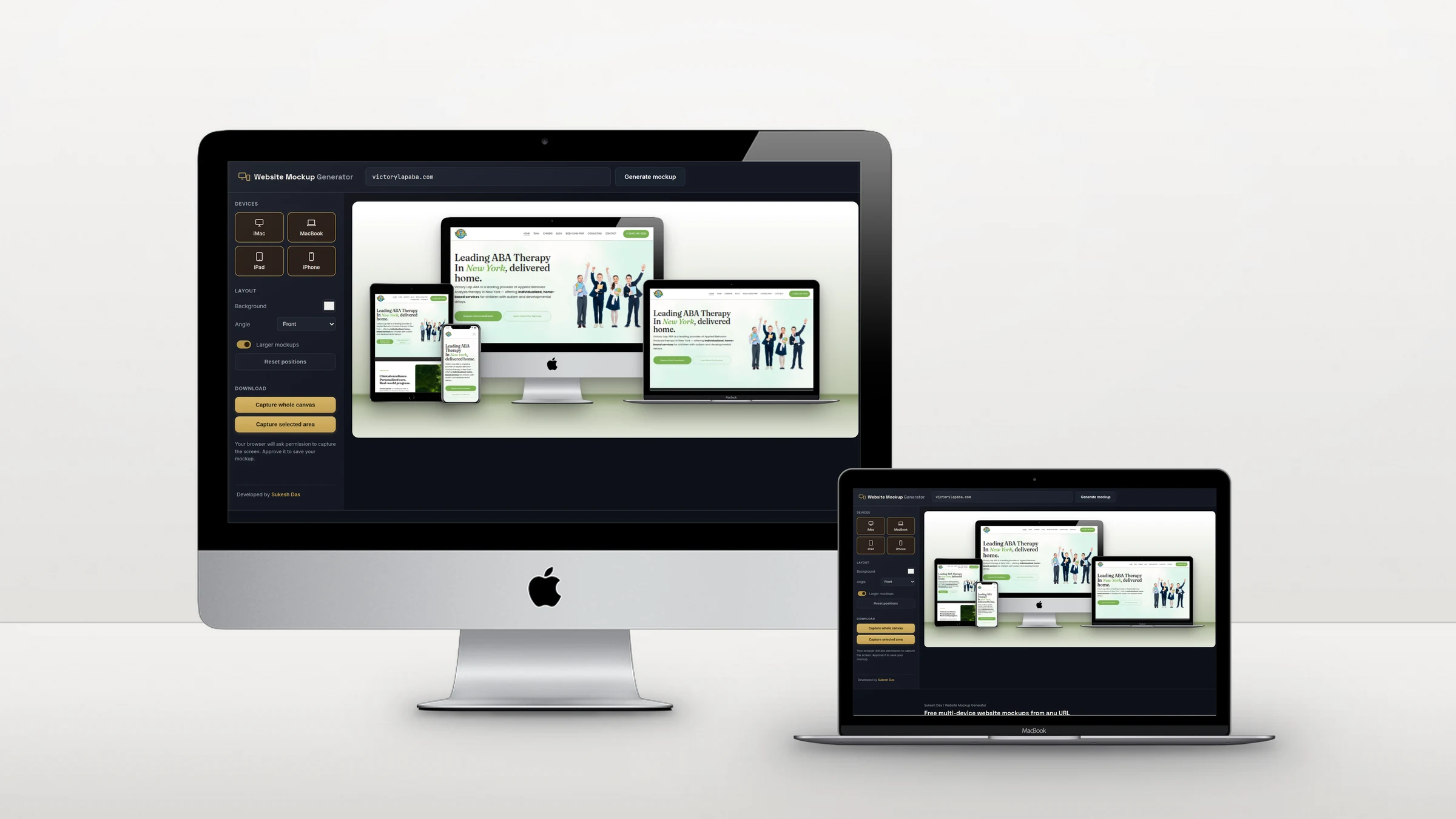
Quick answer: Open the free Website Mockup Generator, paste the site’s URL and click Generate mockup. The site loads live on an iMac, a MacBook, an iPad and an iPhone, each at its real screen width. Arrange the devices, pick a background, then click Capture whole canvas to save a PNG.
What you get
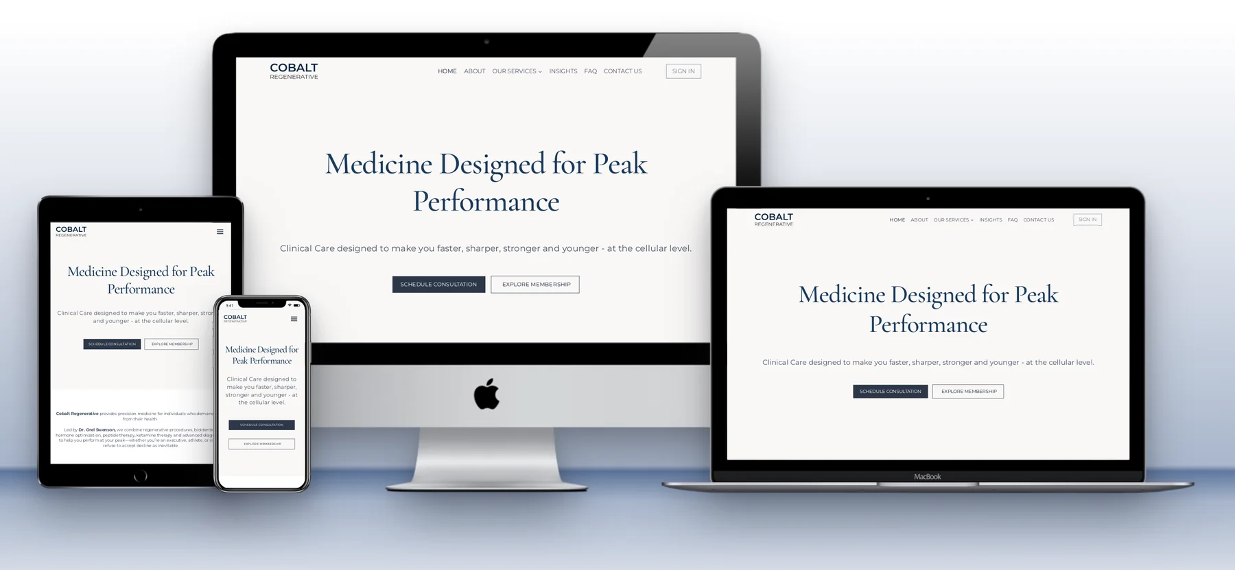
Here is a mockup made with the tool for a speech therapy practice I built. Every device shows the layout that size of screen actually gets: the desktop site on the iMac and MacBook, the tablet layout on the iPad and the mobile layout on the iPhone.

Step by step
- Paste the URL. Type the address at the top, for example yourclient.com, and click Generate mockup.
- Let it settle. Give it a few seconds for fonts, sliders and animations to finish. Each frame is a live page, so you can scroll it or close a cookie banner.
- Arrange it. Turn devices on or off, drag them around, choose Front or a perspective angle, and pick a background colour.
- Save it. On a computer, click Capture whole canvas, or Capture selected area to crop. Your browser asks which tab to share: pick this one, and the PNG downloads.
You can also link straight to a ready-made preview by adding the address to the link, for example sukeshdas.com/website-mockup/?url=yourclient.com. That is handy for sending a client a quick look at their site on every device.
Why real widths matter
A lot of mockup tools paste one desktop screenshot into every frame, so the phone shows a tiny desktop site. That looks wrong to anyone who builds websites, and to clients who open their site on a phone every day. This tool loads each device at the width it really uses: 1440 pixels for the iMac and MacBook, 810 for the iPad and 390 for the iPhone. If the mobile menu is broken, you will see it.
Tips for a clean mockup
- Close pop-ups and chat bubbles inside each frame before you capture.
- Scroll the phone to a different section from the desktop to show more of the site in one image.
- Take the background colour from the site’s own palette so the image feels branded.
- Turn on Larger mockups for a bigger, sharper export.
When a site won’t load
The tool fetches the page for you, so a few sites refuse it: ones behind strict bot protection such as some Cloudflare settings, password-protected pages and local development sites. For those, use a public staging link, or take screenshots and use a static mockup instead.
Need the website, not just the mockup?
I design and build websites on WordPress, Squarespace and custom code, and every project in my portfolio is shown this way. If you’re planning a new site, let’s talk.
Frequently asked questions
Is the website mockup generator free?
Yes. No signup, no watermark and no limit.
Can I make a mockup on my phone?
You can build and preview one on a phone, but saving it needs a desktop browser, because mobile browsers don’t allow screen capture.
Can I use the mockups commercially?
Yes, for showing your own or your clients’ websites in portfolios, proposals and posts. Apple device frames are recognisable, so avoid implying any endorsement by Apple.
Why does a site look different from my screenshot?
Each frame loads the site fresh, so you see what a new visitor sees: no logged-in toolbar, and any cookie banner or pop-up still showing until you close it.