
Vitality Chiropractic in Tucson was the first clinic in the city to offer StemWave, a non-invasive shockwave treatment for joint and tendon pain. They were running ads for a $59 first-visit voucher and needed a page built for one job: turning someone in pain into a booked consultation.
A landing page, not a website page
Ad traffic behaves differently from someone browsing a clinic’s website. They clicked on one offer, they are a little sceptical, and they will leave the moment the page makes them think. So this page lives on the clinic’s Squarespace site but works on its own, with its own header, one offer and one goal.
The custom header
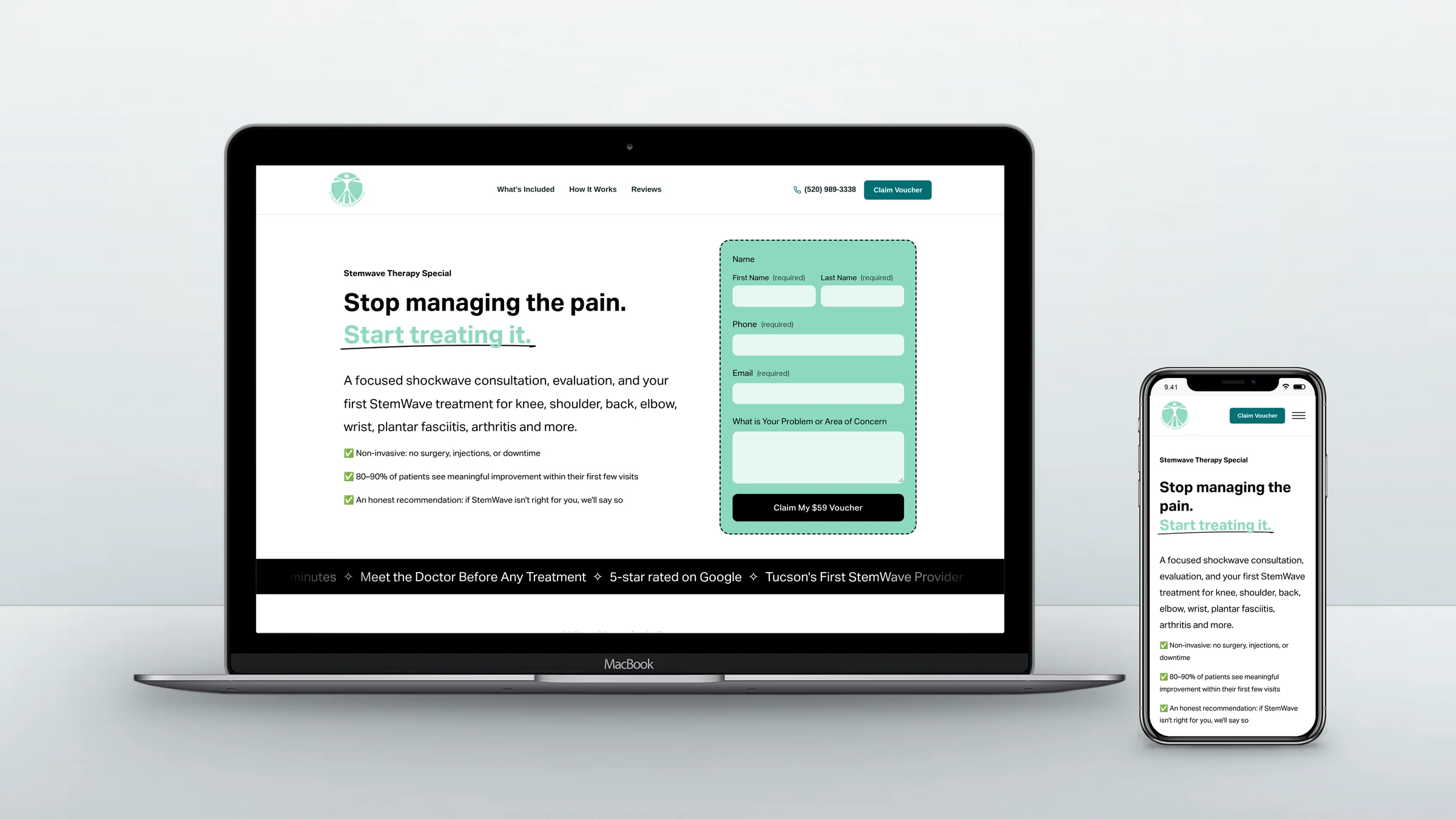
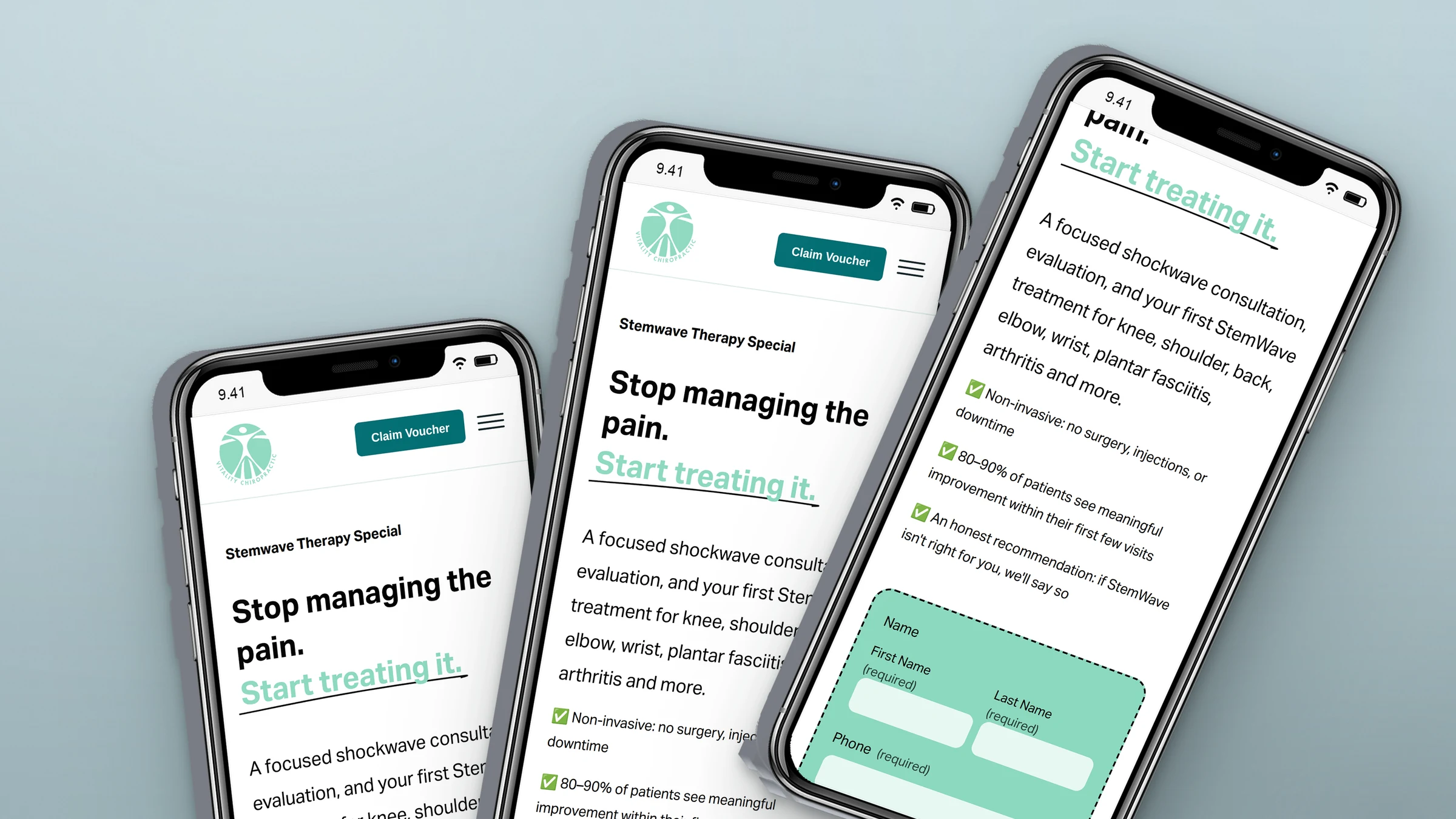
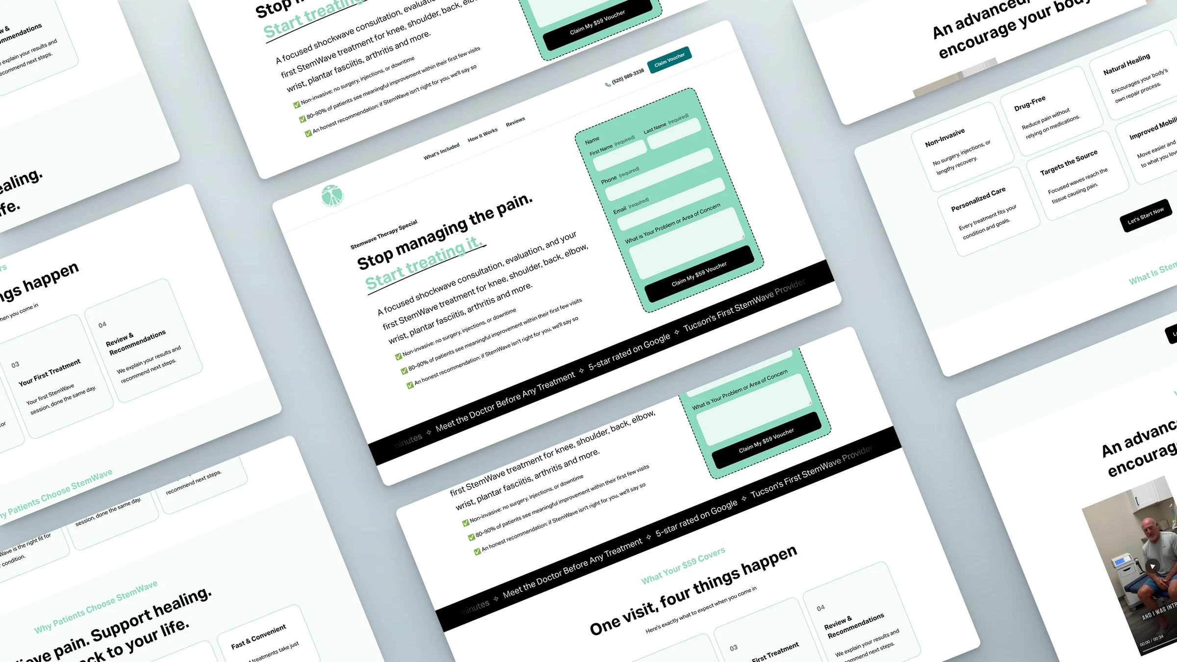
Squarespace’s standard header would have shown the clinic’s full menu, giving visitors a dozen ways to wander off. I replaced it on this page with a custom-coded header that only does what a visitor here needs:
- Three jump links (What’s Included, How It Works, Reviews) that scroll to the sections people check before deciding
- A click-to-call phone number, because many patients in pain would rather talk to someone first
- A “Claim Voucher” button that stays in view, so the next step is always one tap away, on any screen size
Why it converts
The form is in the first screen
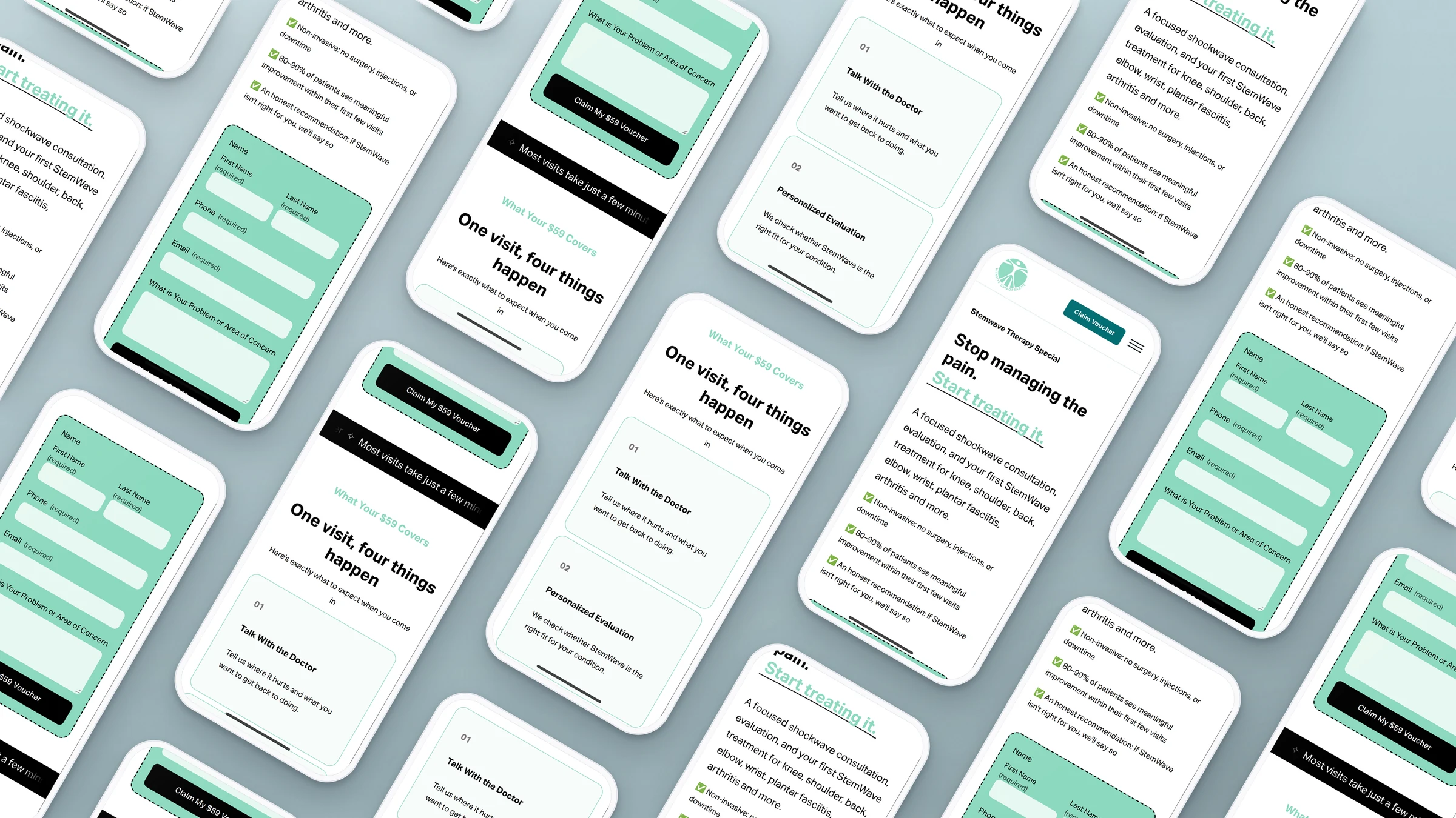
Visitors who already decided from the ad can claim the voucher without scrolling. The short form sits right beside the headline on desktop and just below it on phones, and it asks only for a name, phone, email and where it hurts. No payment is needed to reserve, which lowers the commitment and brings in more enquiries. The clinic confirms each appointment by phone.
It speaks to the pain first
The headline, “Stop managing the pain. Start treating it.”, meets visitors where they are. Right under it, three quick points answer the first worries: no surgery or injections, how often patients improve, and an honest recommendation if StemWave is not right for them.
The offer is crystal clear
“What your $59 covers” breaks the visit into four numbered steps: talk with the doctor, an evaluation, the first treatment, then recommendations. People book more readily when they know exactly what will happen in the room.
Trust is built in layers
A scrolling trust strip (5-star rated, Tucson’s first StemWave provider, meet the doctor first), a plain explanation of how StemWave works, the conditions it treats, and real Google reviews each remove one more reason to hesitate.
There is always a next step
A call to action follows every section, worded for that moment: “Let’s Start Now”, “Yes, I Want My Voucher”, “Schedule My Consultation”. The page ends where it began, with the voucher form and a short recap of what is included, so whenever a visitor is convinced, the next step is already there.
Responsible copy
Healthcare pages have to be careful with promises. The copy is confident but honest, including a clear note that no treatment can guarantee results. That keeps the page trustworthy for patients and safer for the clinic.
Running ads for a clinic or service? Let’s build a landing page that turns clicks into bookings.