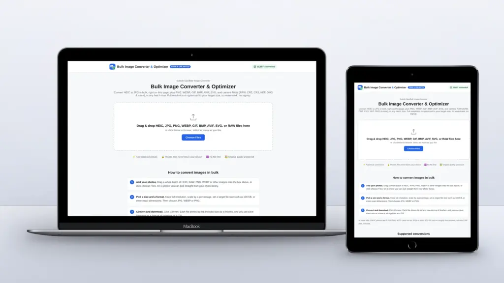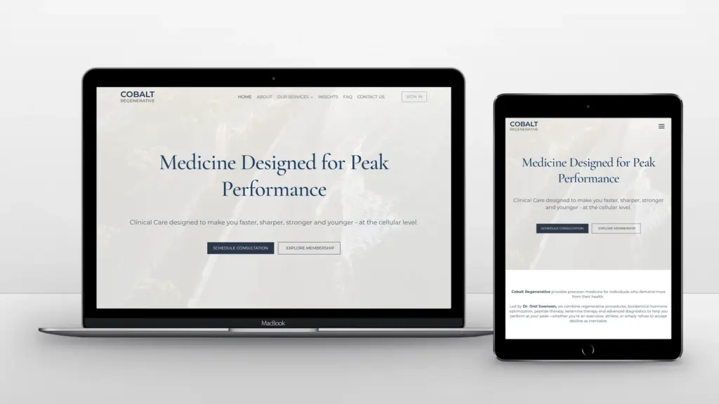

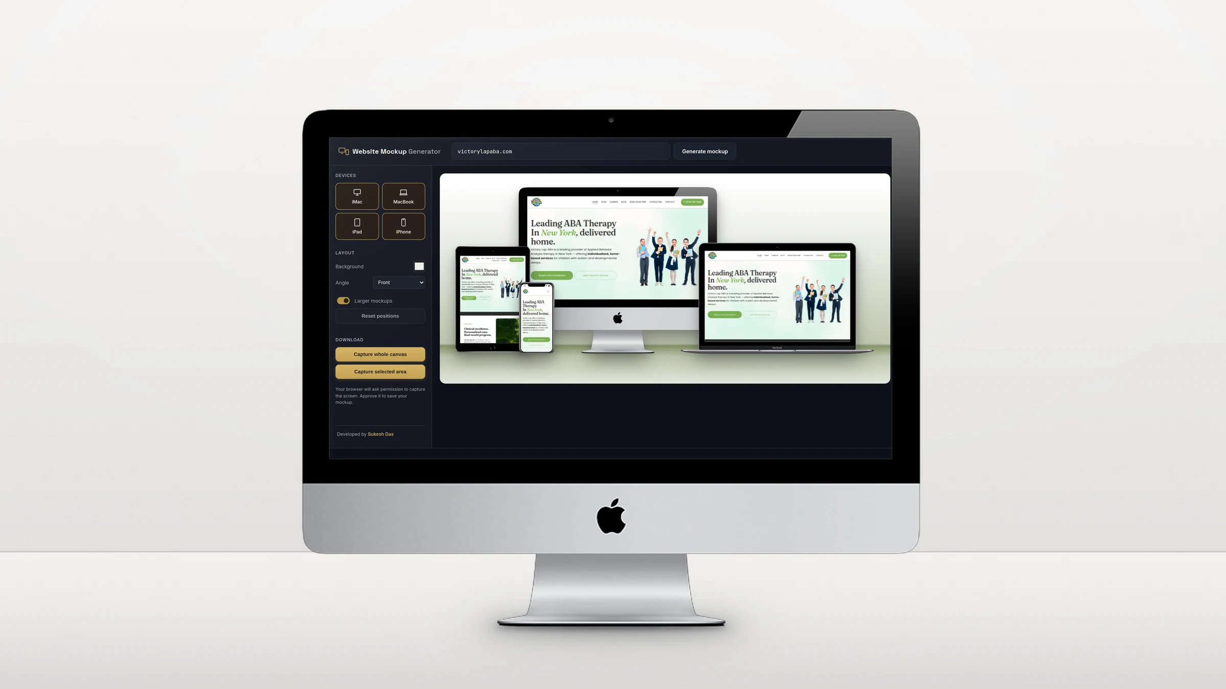
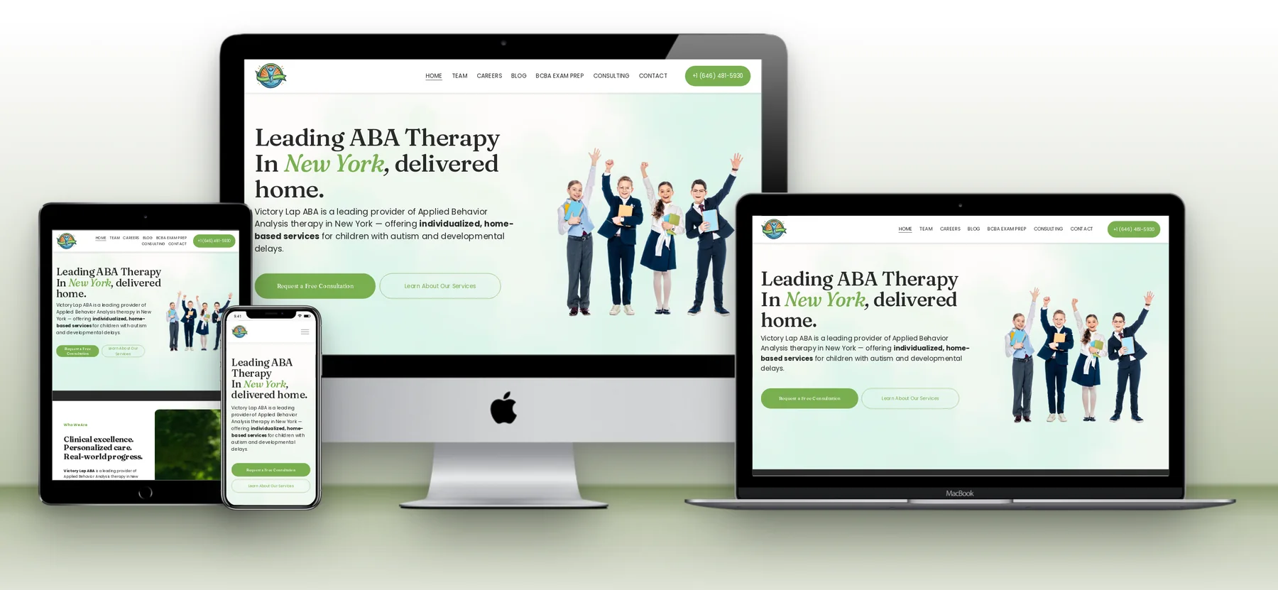
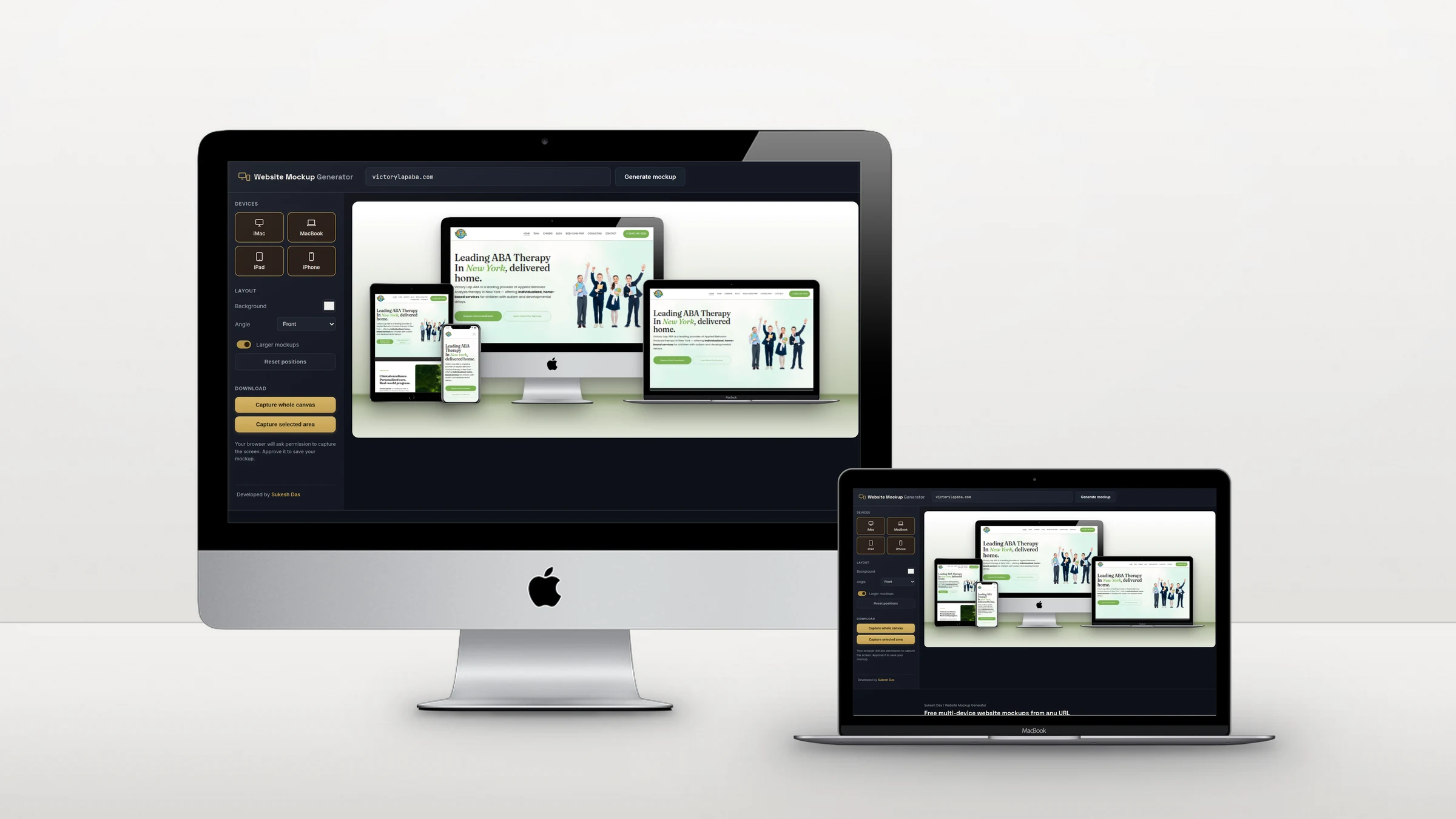
The Website Mockup Generator turns any public URL into a multi-device mockup. The site loads live inside an iMac, a MacBook, an iPad and an iPhone at the same time, each at the width that device really uses, and the whole canvas can be saved as a PNG in a couple of clicks.
Why I built a free website mockup generator
I show every website I build on several devices, and the tools for it kept getting in the way. Template sites want a subscription before you can download. Design apps want an account and a screenshot you take and crop yourself. Some free generators have no download button at all, and some put one desktop screenshot into every frame, so the phone shows a tiny desktop site instead of the real mobile layout.
So I built the one I wanted: paste a URL, see the live site on an iMac, MacBook, iPad and iPhone with their real layouts, and save the mockup as a PNG. Free, no sign-up, no watermark.
How it compares with other mockup tools
If you are looking for a TechSini, Shots.so, Placeit or Smartmockups alternative that works straight from a URL, this is how they compare.
| Tool | How it works | Download | Cost |
|---|---|---|---|
| This generator (sukeshdas.com) | Paste a URL; the live site loads on 4 devices at real widths | Built-in PNG download (canvas or selected area) | Free, no account, no watermark |
| TechSini Multi-Device Mockup | Paste a URL; the site loads in 4 Apple devices | No download button; their page suggests Print Screen or a screenshot extension | Free |
| Shots.so | Upload your own screenshots into device frames | PNG or JPG; WebP export and premium effects on paid plans | Free plan; paid from $8 a month |
| Placeit | Pick a template and upload a screenshot | Unlimited downloads with a subscription | From $7.47 a month |
| Canva Mockups (formerly Smartmockups) | Upload a screenshot into a mockup template | Inside Canva | Needs a Canva account |
Details as shown on each tool’s own website in October 2026. They can change.
What this mockup generator does that others don’t
- Works straight from a URL. No screenshots to take, crop and upload. Paste the address and the site loads in every device.
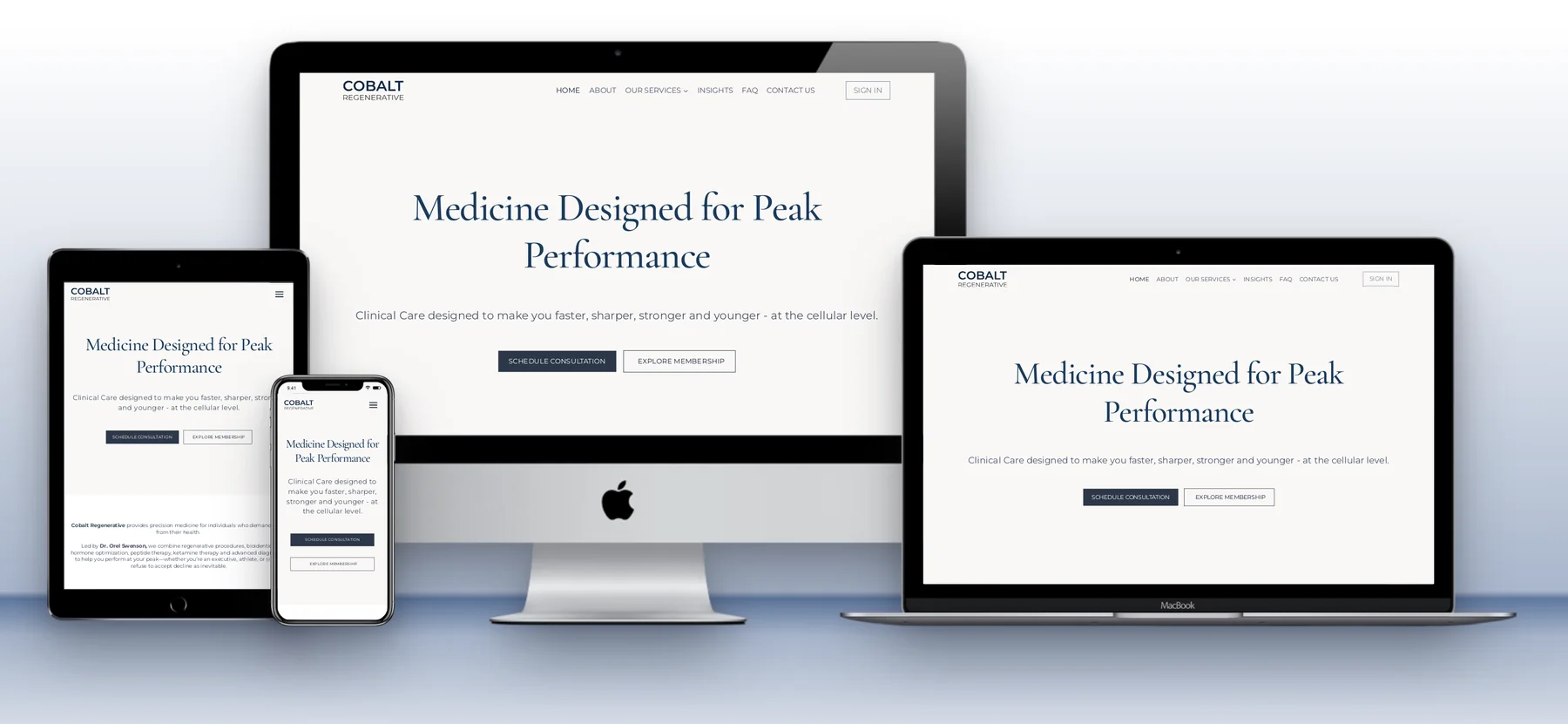
- Real layouts on every device. Each frame loads the site at the width that device really uses (1440, 810 and 390 pixels), so the phone shows the true mobile layout, not a shrunken desktop page.
- Loads sites that block framing. Many websites refuse to be shown inside another page, which is why some URL-based mockup tools show a blank frame for them. This one fetches the page through its own proxy, so most sites load.
- Live, clickable frames. Scroll each device to a different section, open a menu or close a cookie banner before you save.
- A real download button. Save the whole canvas or crop a selected area as a PNG. No Print Screen, no browser extension, no editing afterwards.
- Shareable preview links. Send a link like /website-mockup/?url=client.com&larger=1 and it opens with the mockup already built.
- Full control of the layout. Drag devices anywhere, hide the ones you don’t need, pick any background colour, choose a front or perspective view and switch to larger mockups.
- Free, with no account, watermark or subscription. No sign-up and no paid plan to unlock downloads.
Who it is for
- Web designers and agencies who need responsive website mockups for portfolios and case studies
- Freelancers sending proposals, progress updates or launch announcements to clients
- Developers checking a responsive layout on desktop, tablet and phone in one view
- Business owners who want a multi-device image of their site for LinkedIn, social media or a pitch deck
Live pages, not screenshots
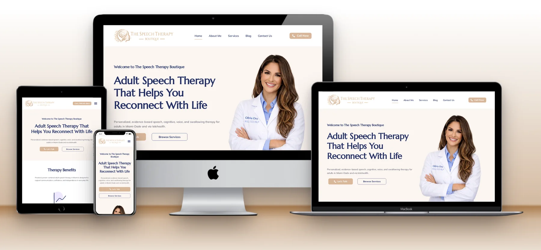
Each device holds a live copy of the site. Many websites refuse to be shown inside another page, so a small PHP proxy fetches the page, removes the headers that block framing, adds a base address so its images and styles still load from the original site, and strips content security rules that would otherwise break it. Each frame renders at 1440, 810 or 390 pixels wide and is scaled to fit its device, so menus, columns and buttons behave exactly as they do on the real screen.
Getting the details right
- Device frames are real images with the screen areas cut out, and the screen positions were measured precisely so nothing overlaps the bezel
- Dragging uses pointer capture, so a device keeps moving even when the cursor passes over a live page
- Saving moved from server-side screenshots to the browser’s own screen capture, which saves exactly what you see, cropped to the canvas or to an area you select
- Controls for background colour, a front or perspective view, larger mockups and resetting positions
Making it public, safely
Opening a personal tool to everyone changes the risks. In October I reviewed it before pushing it for search. Because the proxy served other websites from sukeshdas.com, a third-party page’s scripts could in principle have run with this site’s permissions. Proxied pages now load in a sandbox with their own isolated origin, only inside the tool’s frames, and are kept out of search results.
I also gave the page a proper heading structure, a how-to, use cases, an FAQ with structured data and a place in the sitemap, added Google Tag Manager events for generating, arranging and saving mockups, and added shareable links: adding ?url= to the address loads a site straight away.
Where it stands
Every project in my portfolio is presented with multi-device mockups, and this tool makes a first version of one in about a minute. It scores 100 for accessibility in Google Lighthouse.
Try the mockup generator, or read how to create a website mockup from a URL.
Want a tool built around your own workflow? See custom web app development or get in touch.